library(tidyverse)
library(ggtext)
df <- data.frame(
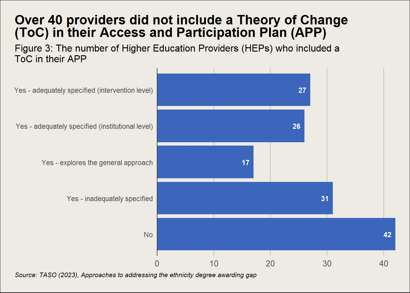
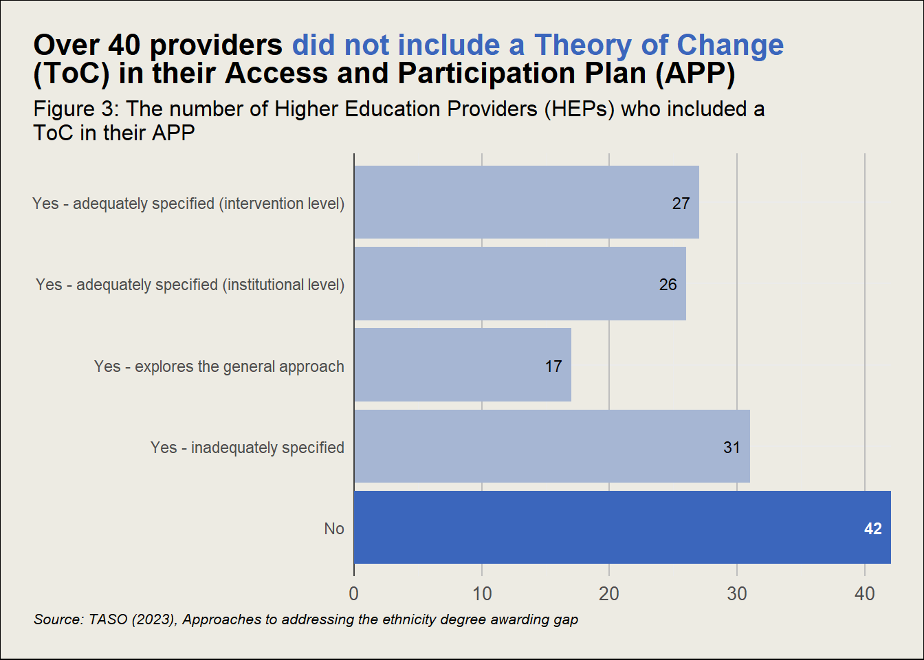
category = c("No",
"Yes - inadequately specified",
"Yes - explores the general approach",
"Yes - adequately specified (institutional level)",
"Yes - adequately specified (intervention level)"),
count = c(42, 31, 17, 26, 27)
)
ggplot(df, aes(x = count, y = factor(category, levels = c("No",
"Yes - inadequately specified",
"Yes - explores the general approach",
"Yes - adequately specified (institutional level)",
"Yes - adequately specified (intervention level)")))) +
# ^ sorting the bars in the chart in desired order
geom_bar(stat = "identity", fill = "#EDEBE3") + # Adding bars of same colour as background underneath so alpha can be used for colouring
geom_bar(stat = "identity", fill = "#3b66bc", alpha = 0.4) + # Bar chart coloured peacock
theme_minimal() + # Setting the theme as minimal, adding elements we want back in
# Title, subtitle, axis titles and caption
labs(
title = 'Over 40 providers <span style="color:#3b66bc;">did not include a Theory of Change</span> (ToC) in their Access and<br>Participation Plan (APP)',
# By using ggtext::element_markdown, we can use markdown stylings to colour specific words in the chart to highlight a point
subtitle = "Figure 3: The number of Higher Education Providers (HEPs) who included a ToC in their APP",
caption = "Source: TASO (2023), Approaches to addressing the ethnicity degree awarding gap",
x = NULL, # Not showing X or Y axis title for this example chart
y = NULL
) +
scale_x_continuous(expand = c(0,0)) +
geom_vline(xintercept = 0, colour = "#404040", linewidth = 0.5) +
# Theme elements
theme(
text = element_text(family = "Barlow", size = 12),
plot.title.position = "plot",
plot.title = ggtext::element_markdown(family = "Neuton", size = 16),
plot.subtitle = element_text(size = 12),
plot.caption.position = "plot",
plot.caption = element_text(hjust = 0, size = 9, face = "italic"),
plot.background = element_rect(fill = "#EDEBE3", color = NA),
plot.margin = margin(0.25, 0.25, 0.25, 0.25, "in"),
panel.border = ggplot2::element_blank(),
panel.grid.major = element_line(colour = "#CECABC", linewidth = 0.3),
panel.grid.minor = element_blank(),
panel.background = ggplot2::element_rect(fill = "#edebe3", color = NA),
axis.text = element_text(size = 11),
axis.title = element_text(size = 11, face = "italic"),
axis.line.y = element_blank(),
axis.line = element_line(colour = "#485866", linewidth = 0.5),
axis.text.x = element_text(margin = margin(t = 7, unit = "pt")),
axis.ticks.length = unit(0.3, "cm"), # Increase the length of ticks
axis.ticks.x = element_line(colour = "#485866", linewidth = 0.5),
legend.position = "none"
) +
# Other helpful elements
coord_cartesian(clip = "off") +
geom_bar(data = subset(df, category == "No"), fill = "#3b66bc", stat = "identity", show.legend = FALSE) +
geom_text(aes(label = count, colour = category), vjust = 0.5, hjust = 1.5, size = 3, fontface = "bold",
data = subset(df, category == "No"), color = "white") +
geom_text(aes(label = count, colour = category), vjust = 0.5, hjust = 1.5, size = 3,
data = subset(df, category != "No"), color = "black")