| |
| Evaluators |
Diagnose: Identifying equality gaps using institutional data


Identifying equality gaps in your institution is a core part of the APP and Teaching Excellence Framework (TEF) processes. Here, we go above and beyond the OfS guidance and data dashboards to help providers have a deeper understanding of where equality gaps may lie in their institution.
The degree to which you can identify and understand equality gaps will depend on the data you have available. In this guide we define two broad classes of data, the learner context and the institution context:
- The learner context is data about the learner when they begin higher education – e.g. demographics and prior attainment - and as they progress through higher education (e.g. engagement with their course and the institution).
- The institution context is data about the institution relevant to the learner’s studies, such as courses and modules that are studied, contact hours, types of contact, types of assessment and timetable information.
In Table 1 we also define three levels of data: Foundation, Intermediate, and Advanced. Although the levels of data are segregated, it is likely that institutions will have data from more than one of these levels. Data in each additional level provides increasing context for the learner and the institution. Not all of the data listed in Table 1 will be useful for identifying equality gaps, but may be useful in understanding what is required from an intervention to reduce equality gaps.
Note
The Jisc Data maturity framework may be useful to understand your institution’s data capability in terms of the infrastructure, the data you collect, and the role of people who use it.
| Level | Learner | Institution |
|---|---|---|
| Foundation | Demographics; for example | Course studied |
| - Sex | Modules studied | |
| - Ethnicity | ||
| - Disability status | ||
| - Prior attainment | ||
| - Contextual offer holder | ||
| - Area-based measures (IMD, POLAR4, TUNDRA) | ||
| End-of-stage grades | ||
| Continuation | ||
| Intermediate | Engagement data | Course contact hours |
| Attendance | Contact hours split by module | |
| Virtual learning environment usage | Extra curricular contact hours | |
| Library use | ||
| Course materials access | ||
| Extenuating circumstances | ||
| Module marks | ||
| Advanced | Engagement with extra-curriculars | Timetable of contact hours |
| Engagement with support | Assessment deadlines | |
| Personal tutor | Module prerequisites (for example, passing a prior module/assessment required to sit this module) | |
| Academic skills | Support services available to the student | |
| Pastoral support | Personal tutor | |
| Leave of absence | Academic skills | |
| Assessment submission data (timing, attempts) | Pastoral support | |
| Use of reading lists | ||
| Within-module assessment grades |
Identifying gaps in the student experience
| Evaluators |
To effectively identify gaps in the student experience, we can use a range of statistical techniques, as outlined in Table 2. This begins with descriptive statistics, which give a foundational understanding of the data by summarising and describing key features, such as counts and measures of average.
For a more in-depth statistical analysis, inferential techniques like t-tests and ANOVAs are useful. T-tests enable the comparison of means between two groups, highlighting statistically significant differences. ANOVAs extend this comparison to multiple groups.
Regression is a powerful tool for those who want to quantify the effect of various factors on student outcomes and explore in more detail the relationship between these factors.
Note
Here, we use the Open University Learning Analytics Dataset (OULAD). This analysis is educational and illustrative, to show the potential applications of various statistical techniques, using a dataset with variables familiar to many institutions.
The R code to create figures and tables below is available on our GitHub page.
| Method | Purpose | Focus | Example |
|---|---|---|---|
| Descriptive statistics | Summarise and describe the basic features of the dataset. | Averages (mean, median, mode), variability (standard deviation, range). | Students from deprived areas (IMD quintiles 1 and 2) score X% on average, while their peers who are not from deprived areas (IMD quintiles 3-5) score Y% on average. |
| T-test | Compare means between two groups. | Assess if there is a statistically significant difference between the means of two groups. | Is there a statistically significant different between the attainment of two groups?; e.g. comparing the attainment of students from IMD quintiles 1 and 2 with the attainment of students from IMD quintiles 3-5. |
| Analysis of Variance (ANOVA) | Compare means across multiple groups. | Determine if there are statistically significant mean differences across three or more groups. | Is there a statistically significant difference in attainment across more than two groups?; e.g. comparing the score of students by their highest previous qualification (Below A Level vs A Level vs higher education qualification). |
| Regression | Explore relationships between variables and predict outcomes. | Identify the impact of predictor variables on an outcome variable while controlling for variability due to other factors, assess the strength and direction of relationships, and make predictions based on the model. | Is there a statistically significant effect of socio-economic status and gender on attainment when controlling for prior attainment and course studied? |
Descriptive analysis
Identifying performance gaps among different student groups is important. It allows us to understand how various factors like socio-economic status, gender and disability contribute to disparities in outcomes. Recognising these gaps is the first step to developing interventions that can mitigate the effects of such disparities.
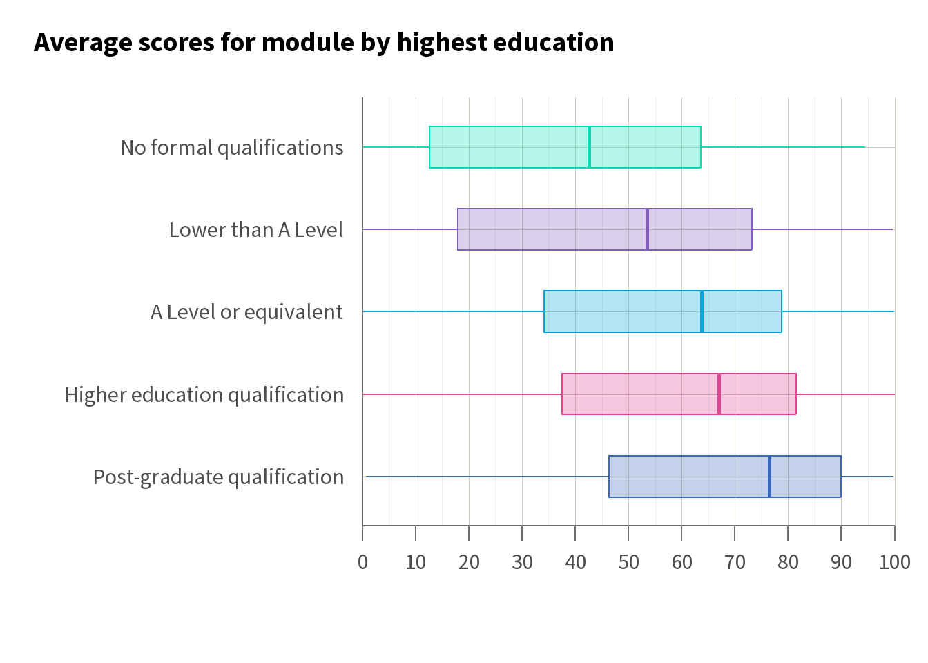
For example, if we believe that there is likely to be a gap in attainment between students from deprived areas (IMD quintile 1 and 2) and students who are not from deprived areas (IMD quintiles 3 to 5), we might start by visualising the average attainment in terms of module scores. Using a box plot, as in Figure 1, helps us to see how the distribution of scores differs between these groups.
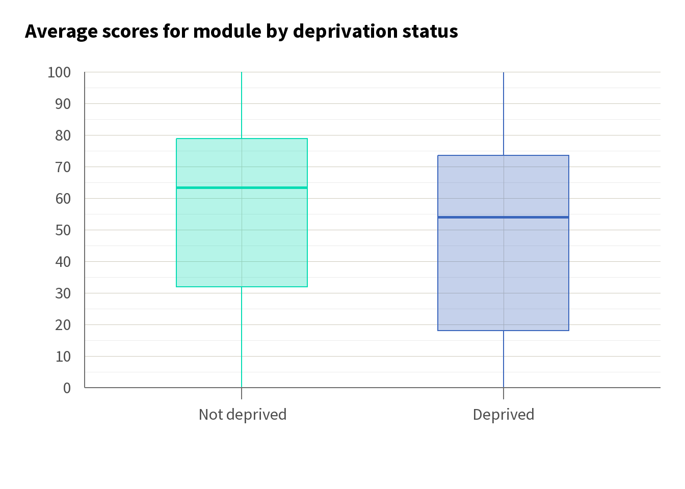
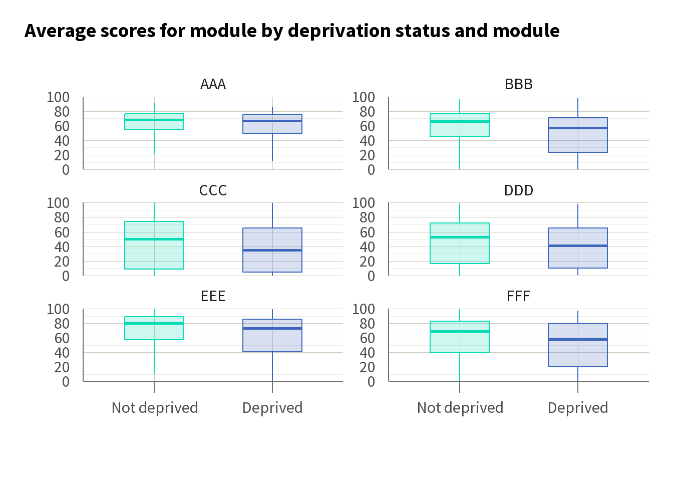
Here, we can see that students from deprived areas tend to have lower average module scores compared with their counterparts from more affluent areas. This observation underscores the potential need for targeted interventions aimed at supporting students facing socio-economic challenges. Breaking this down by module, we can see that while average scores vary, a gap remains across the modules.
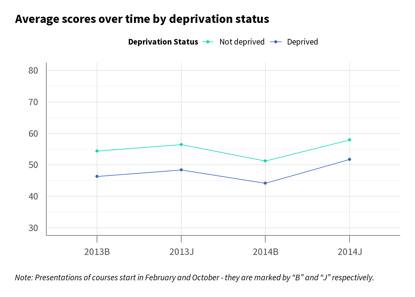
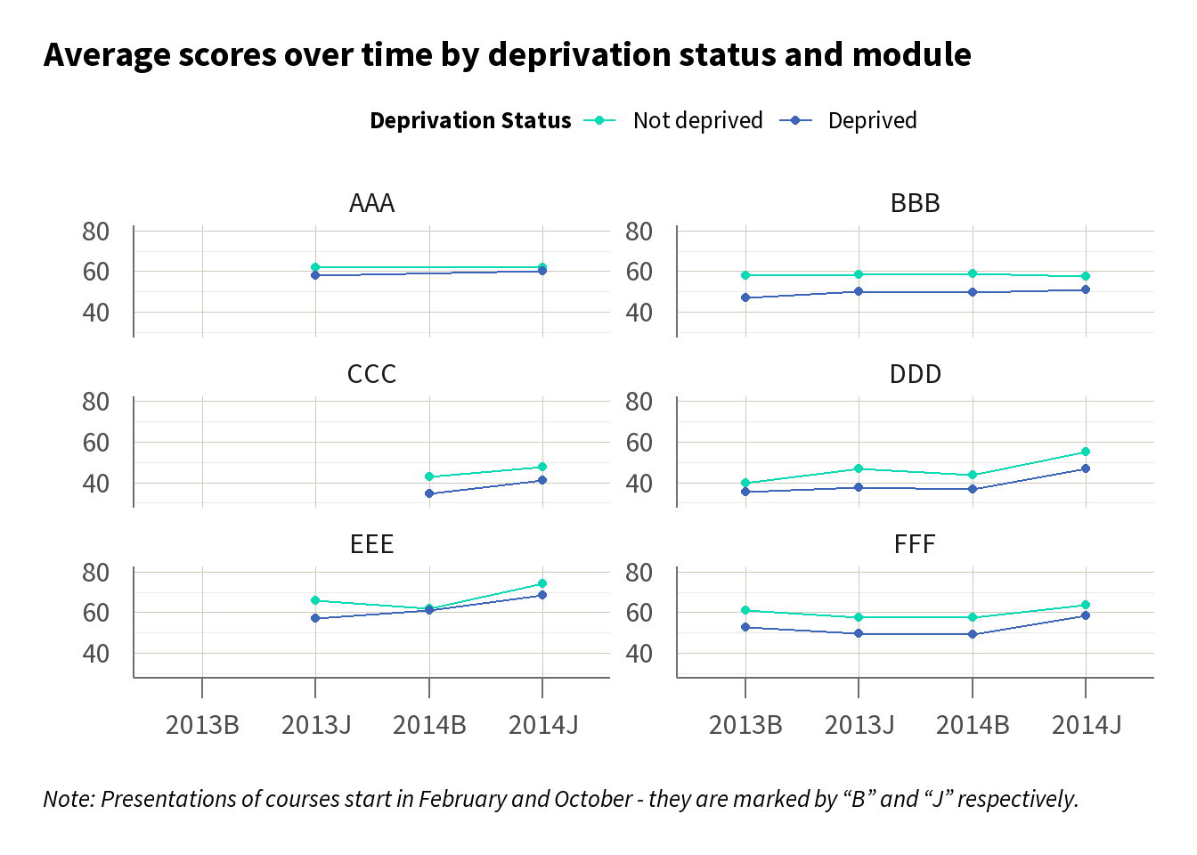
To further understand the dynamics of this gap, we may want to look at how it has changed over time. Line charts, as in Figure 2, can serve as an effective visual tool, illustrating the trend of average scores by deprivation status across different time periods. In Figure 2 we can see there is a consistent gap over time across the courses, suggesting that the gap we have identified is persistent.
T-tests
In Figure 1 above, we saw there was a 7.3 percentage point (pp) difference in scores between students from deprived areas (score = 48.2%) and students who are not from deprived areas (55.5%). However, looking at these charts alone, we cannot say whether the differences are meaningful or just random variation.
We can use t-tests to determine if the difference in mean scores between students from deprived backgrounds and those who are not deprived is statistically significant using the conventional cut-off for the p-value of 0.05.
The results of the t-test in Table 3, indicate that there is a statistically significant difference at the 5% level because the p-value is less than 0.05. This suggests that on average, students from deprived areas score significantly lower than their counterparts.
To report the results of this t-test in text you would write: There was a significant difference between the scores for students from deprived areas and the scores for students not from deprived areas (t(10686.68) = 15.88, p<0.001).
| Difference (pp) | Lower confidence interval | Upper confidence interval | T statistic | Degrees of freedom | P value |
|---|---|---|---|---|---|
| 7.35 | 6.44 | 8.25 | 15.88 | 10686.68 | < 0.001 |
ANOVA
Building on the concept of t-tests, we can extend our analysis to compare factors with more than two groups (e.g. ethnicity, prior qualification types). This is where ANOVA becomes useful. ANOVA allows us to assess whether there are statistically significant differences in means across three or more groups simultaneously.
For example, ANOVA can enable us to determine whether scores differ based on a student’s highest level of education. By performing ANOVA, we can compare the mean scores across each of the education levels at once, rather than comparing each pair separately. This approach helps to identify if at least one education group has a significantly different mean score compared to the others.
In Table 4, we can see that the ANOVA is significant (p<0.001), indicating that there is evidence that the level of education influences the score.
| Term | Sum of squares | Degrees of freedom | Mean square | F statistic | P value |
|---|---|---|---|---|---|
| highest_education | 362113.3 | 4 | 90528.3 | 109.7 | < 0.001 |
| Residuals | 15433168.8 | 18703 | 825.2 |
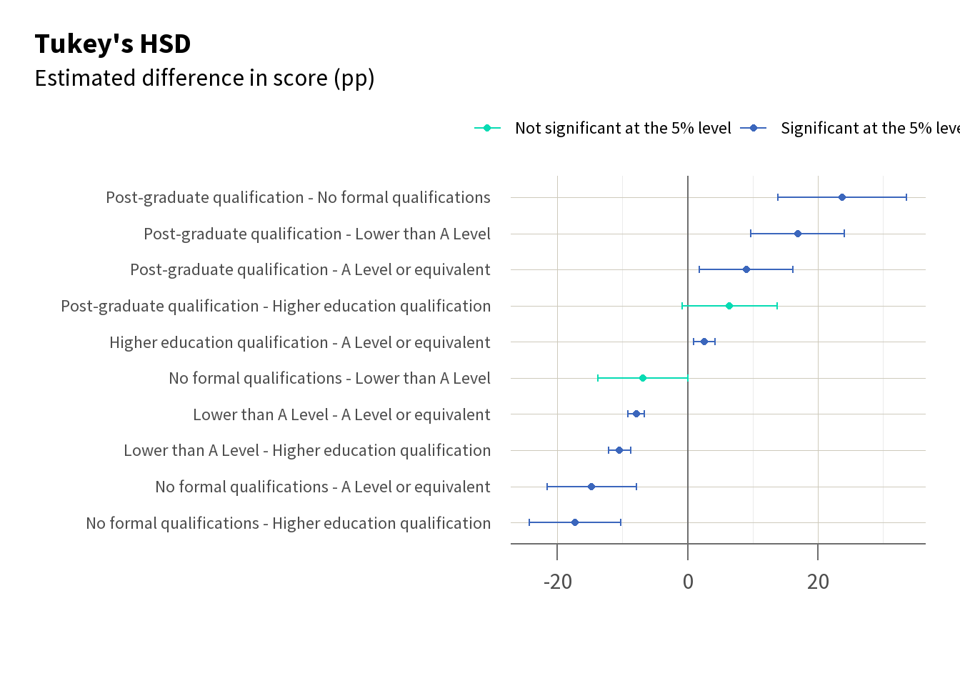
Given that there is evidence of a relationship between highest qualification and the scores, you can then conduct further tests such as Tukey’s HSD (a form of pairwise t-test) to determine which specific groups differ from each other, as shown in Table 5. This enables us to see, for example, that there is a significant difference in score between students with lower than A Level or equivalent and students with A Levels (highlighted pink), but not a significant difference between students with lower than A Level and students with no formal qualifications (highlighted green).
| Comparison | Difference | Lower confidence interval | Upper confidence interval | Adjusted p value |
|---|---|---|---|---|
| Higher education qualification - A Level or equivalent | 2.57 | 0.91 | 4.23 | <0.001 |
| Lower than A Level - A Level or equivalent | -7.88 | -9.15 | -6.60 | <0.001 |
| No formal qualifications - A Level or equivalent | -14.70 | -21.60 | -7.80 | <0.001 |
| Post-graduate qualification - A Level or equivalent | 9.03 | 1.85 | 16.20 | 0.005 |
| Lower than A Level - Higher education qualification | -10.45 | -12.16 | -8.73 | <0.001 |
| No formal qualifications - Higher education qualification | -17.27 | -24.26 | -10.28 | <0.001 |
| Post-graduate qualification - Higher education qualification | 6.46 | -0.81 | 13.72 | 0.109 |
| No formal qualifications - Lower than A Level | -6.82 | -13.74 | 0.09 | 0.055 |
| Post-graduate qualification - Lower than A Level | 16.90 | 9.72 | 24.09 | <0.001 |
| Post-graduate qualification - No formal qualifications | 23.73 | 13.85 | 33.61 | <0.001 |
Figure 3 visualises these differences. We can see both the difference in scores by highest education using descriptive measures (in this case the median score using a boxplot), and the statistically significant differences in score between these qualification levels.
Regression
Descriptive statistics, such as means or medians, and t-tests and ANOVAs are invaluable for highlighting disparities. But to explore in more depth, it can be useful to progress to regression analysis.
Regression analysis helps identify the relationship between an outcome (like module score) and a factor (such as gender), while accounting for other demographic variables (such as ethnicity or socio-economic status). It is particularly useful for exploring how an outcome is influenced by the interaction of two or more factors. For example, regression analysis can show how the interaction of deprivation status and gender impacts modules scores, while also accounting for other factors that may affect scores.
While descriptive statistics show us the extent of equality gaps, and t-tests and ANOVAs can tell us whether these gaps are statistically significant, regression analysis can give us some of the more detailed insights needed to provide targeted interventions.
Simple model
In a basic linear regression model, we use only one explanatory variable - here deprivation status - to predict the dependent variable, which is the score.
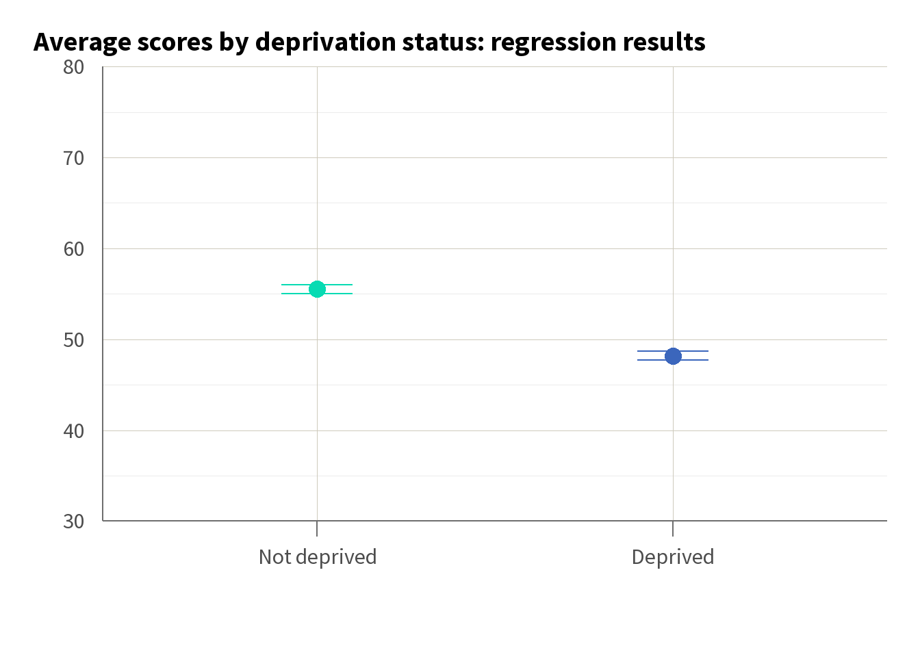
While this simple regression is comparable to our t-test in that it assesses the difference between two groups, it also allows us to quantify the exact impact of deprivation status on scores. Unlike the t-test, which only tells us if there is a significant difference, regression provides an estimate of how much lower students from deprived areas score on average. Here, the regression results in Table 6 tell us that students from deprived areas score, on average, 7 marks lower (see highlighted row).
| Simple model | |
|---|---|
| (Intercept) | 55.537*** |
| (0.253) | |
| deprivation_statusDeprived | −7.347*** |
| (0.458) | |
| Num.Obs. | 18708 |
| R2 | 0.014 |
| R2 Adj. | 0.014 |
| RMSE | 28.86 |
| + p < 0.1, * p < 0.05, ** p < 0.01, *** p < 0.001 |
We can visualise this simple regression in a chart, as in Figure 4, with lines indicating our 95% confidence interval. However, this alone tells us relatively little about what impacts scores. Our adjusted R-squared of 0.014 tells us that deprivation status can only explain 1.4% of the variance in score.
Simple model with interaction term
To try and gain more detailed insights into how intersecting characteristics influence outcomes, we can introduce an interaction term. In Table 7, we add to our simple regression an interaction between deprivation and gender. By doing so, we can explore whether the impact of deprivation on students’ scores is moderated by their gender.
Using an interaction term like this allows us to identify patterns that may not be evident when looking at these factors independently. This can be important when designing interventions that are sensitive to the needs of different student groups, enabling a more targeted approach.
We see in Table 7 that while deprivation remains a significant predictor, the interaction between deprivation and gender is not significant. This indicates that the relationship between deprivation and score does not significantly differ across genders. In other words, the impact of being from a deprived area on the score is roughly the same for male students as it is for female students.
| Simple model | Interaction model | |
|---|---|---|
| (Intercept) | 55.537*** | 56.176*** |
| (0.253) | (0.387) | |
| deprivation_statusDeprived | −7.347*** | −7.860*** |
| (0.458) | (0.662) | |
| genderMale | −1.116* | |
| (0.512) | ||
| deprivation_statusDeprived × genderMale | 0.863 | |
| (0.919) | ||
| Num.Obs. | 18708 | 18708 |
| R2 | 0.014 | 0.014 |
| R2 Adj. | 0.014 | 0.014 |
| RMSE | 28.86 | 28.86 |
| + p < 0.1, * p < 0.05, ** p < 0.01, *** p < 0.001 |
Full model (multiple regression)
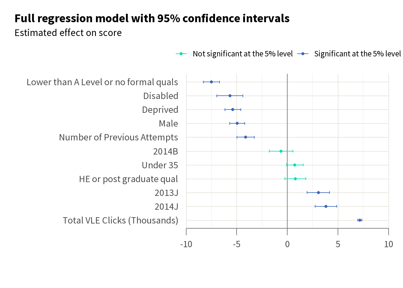
We can expand our model to include additional regressors such as module presentation, previous qualifications, age category, and virtual learning environment (VLE) clicks. Collectively, these factors should give a better view of the variables affecting student scores. By incorporating more predictors, we can identify more subtle relationships, and the impact of each factor on outcomes.
In Table 8, we see significant effects across many of our variables.
| Simple model | Interaction model | Full model | |
|---|---|---|---|
| (Intercept) | 55.537*** | 56.176*** | 46.997*** |
| (0.253) | (0.387) | (0.651) | |
| deprivation_statusDeprived | −7.347*** | −7.860*** | −5.391*** |
| (0.458) | (0.662) | (0.402) | |
| genderMale | −1.116* | −4.943*** | |
| (0.512) | (0.375) | ||
| deprivation_statusDeprived × genderMale | 0.863 | ||
| (0.919) | |||
| disabilityDisabled | −5.676*** | ||
| (0.659) | |||
| code_presentation2013J | 3.069*** | ||
| (0.564) | |||
| code_presentation2014B | −0.615 | ||
| (0.597) | |||
| code_presentation2014J | 3.824*** | ||
| (0.543) | |||
| qualificationsHE or post-graduate qualification | 0.796 | ||
| (0.532) | |||
| qualificationsLower than A Level or no formal qualifications | −7.507*** | ||
| (0.407) | |||
| num_of_prev_attempts | −4.128*** | ||
| (0.436) | |||
| age_categoryUnder 35 | 0.748+ | ||
| (0.412) | |||
| total_vle_clicks_thousands | 7.171*** | ||
| (0.101) | |||
| Num.Obs. | 18708 | 18708 | 18692 |
| R2 | 0.014 | 0.014 | 0.255 |
| R2 Adj. | 0.014 | 0.014 | 0.255 |
| RMSE | 28.86 | 28.86 | 25.07 |
| + p < 0.1, * p < 0.05, ** p < 0.01, *** p < 0.001 |
If we sort and plot these results, as in Figure 5, we get an indication of where it might be best to target an intervention. In particular, we can see that having the highest known qualification being below A Level, having a disability, and being from a deprived area have some of the biggest effects on score. This may prompt us to think about how we can devise interventions to target these groups.
This expanded approach allows us to improve our understanding of the factors that influence our outcome of interest, enabling us to prioritise intervention efforts and design interventions with these factors in mind.
Design your intervention
| Evaluators |
Theory of change
Once a gap has been diagnosed, you can start thinking about how an intervention could address this gap, and about evaluating this intervention.
Developing a theory of change is the first step in TASO’s Monitoring and Evaluation Framework and the foundation of all evaluations. The theory of change should capture the reasons why you think the activities you are doing will cause the change you want to realise.
TASO has a two-strand approach to theory of change development:
- Strand one – Core Theory of Change: used for simplicity and to assist higher education providers with planning interventions and evaluation activities. The Core Theory of Change guidance follows a simple model of mapping inputs, activities, outputs, outcomes and impact. It provides a high-level snapshot of how we expect an activity to lead to impact.
- Strand two – Enhanced Theory of Change: used for evaluability and to assist higher education providers with robustly evaluating interventions and activities. The Enhanced Theory of Change guidance provides a format for capturing much more information about activities and mechanisms by which we expect change to happen. It includes: context; mapping of links between activities and outcomes; and assumptions and change mechanisms.
TipMore theory of change resources
TASO has a range of resources for developing Core and Enhanced Theories of Change, including:
Post-entry typology
To effectively evaluate interventions aimed at improving student success, it’s important to record how students engage with those interventions. Additionally, developing a common language to describe the students involved, the outcomes achieved, and the activities undertaken would help improve our collective understanding across the sector of what works to support student success.
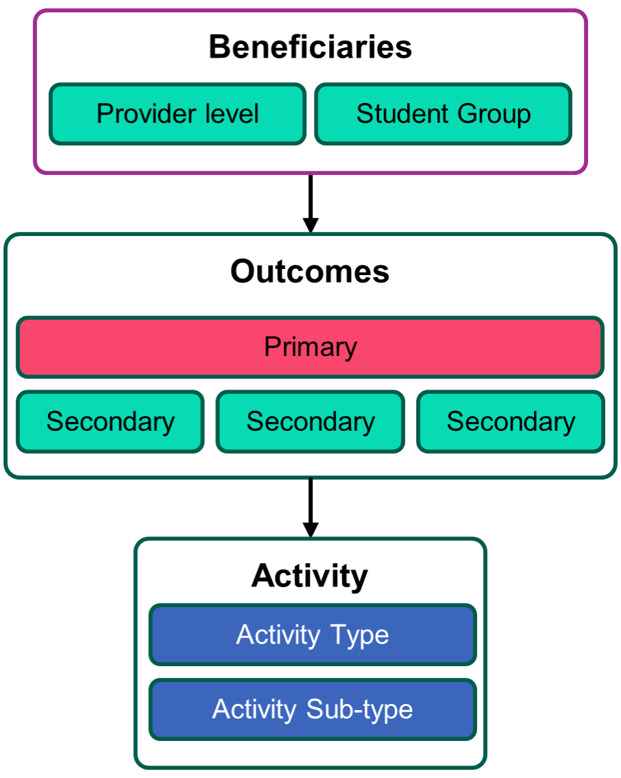
The post-entry MOAT (Mapping Outcomes and Activities Tool) provides a framework to describe your post-entry student support activities, in terms of their intended beneficiaries, outcomes (and suggested measures), their type and sub-type, how they are delivered and, if applicable, how they map on to the Equality of Opportunity Risk Register.
The post-entry MOAT covers any HEP’s activity whose ultimate beneficiary is deemed to be its own students. This includes:
- transition activities designed for students who have confirmed the HEP as a firm choice on their UCAS application
- activities where individual students directly benefited and participated
- activities in which staff or entire departments are the focus; e.g. activities focused on changing the curriculum or academic culture within a school, which may include staff training and administrative or communications activities
- activities involving changes to physical or virtual infrastructure, e.g. improvements to lab or study facilities, or changes to the virtual learning environment.